Another High Street Rebrand
-
ballinagrappa
- Posts: 3
- Joined: Fri 22 Jan, 2021 19.40
Standard Life Aberdeen have changed their name to...
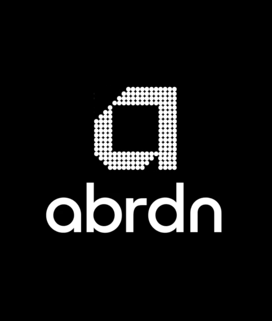
Abrdn

Abrdn
-
scottishtv
- Posts: 763
- Joined: Thu 01 Apr, 2004 15.36
- Location: Edinburgh
There's a certain arrogance about firms when they do this, declaring "it's pronounced 'Aberdeen'".
Except it isn't. You might say it is or want it to be, but the letters on the page do not form a word that says that.
Except it isn't. You might say it is or want it to be, but the letters on the page do not form a word that says that.
-
all new Phil
- Posts: 2018
- Joined: Sun 13 Feb, 2005 00.04
- Location: Next door to Hell
“Digitally enabled brand”. Erm, great. That totally doesn’t sound like something from 15 years ago.ballinagrappa wrote: Tue 27 Apr, 2021 01.49 Standard Life Aberdeen have changed their name to...
Abrdn
Kept meaning to post about this - they rolled out the new brand quite aggressively in stores, replacing all signage (including the totems) within a few weeks. Surprising when you consider how long some brand elements linger about in stores (stuff like late 90s font 'every little helps' which I see now and again). Didn't notice the blobs had reversed tho.thegeek wrote: Wed 21 Apr, 2021 21.09 Tesco Mobile have made a few tweaks - they're (finally) using the new Tesco typeface, have gone flat, and have reversed their blobs.
(apparently this happened back in September but I failed to notice it until now)
They had been using the new font everywhere except the logo for a while, albeit in a weirdly spaced all caps form.
- martindtanderson
- Posts: 527
- Joined: Tue 23 Dec, 2003 04.03
- Location: London, UK
- Contact:
So a mini-revival of British Rail is coming, with Network Rail updating their Station Signage and Wayfinding guidelines, and the government's plan to unify the Railways under the Great British Railways name, and a re-assertion of the "Double Arrows" icon.
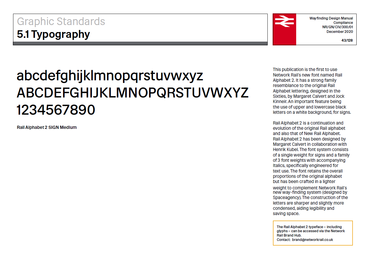
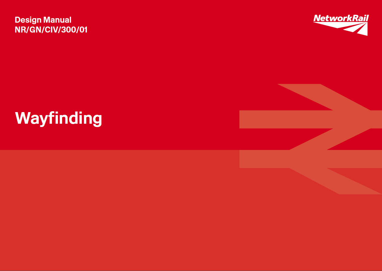


Great British Railways will use updated versions of the classic ‘double arrow’ logo as well as the Rail Alphabet typeface, used in this document. Even after 25 years of privatisation, the logo remains the most widely-used and best-recognised symbol of the railways. It is the standard marker on road signs. It appears on most tickets, online, and at the vast majority of stations. It will stay in those places and increasingly appear on trains, uniforms and publicity material too as and when these are upgraded or replaced as a single, unifying brand for the railways. Keeping it also avoids spending money on yet another new railway logo.
-
scottishtv
- Posts: 763
- Joined: Thu 01 Apr, 2004 15.36
- Location: Edinburgh
Yes, the tabloid headlines write themselves: "Not-So-Great British Rail", "What's So Great About Great British Rail?" etc.
I could sortof understand it is they were going to go for initials GBR and use it commonly like SNCF in France but it would take years to catch on.
Anyway, will the organisation/brand subsume Network Rail and the TOC names? Is the plan to eventually have one website, app and brand for all trains in England, and get rid of the public-facing TOC versions? The TOCs essentially become contractors to Great British Rail? (I should read up on this).
- martindtanderson
- Posts: 527
- Joined: Tue 23 Dec, 2003 04.03
- Location: London, UK
- Contact:
https://www.gov.uk/government/collectio ... ail-reviewscottishtv wrote: Fri 21 May, 2021 11.35 Yes, the tabloid headlines write themselves: "Not-So-Great British Rail", "What's So Great About Great British Rail?" etc.
I could sortof understand it is they were going to go for initials GBR and use it commonly like SNCF in France but it would take years to catch on.
Anyway, will the organisation/brand subsume Network Rail and the TOC names? Is the plan to eventually have one website, app and brand for all trains in England, and get rid of the public-facing TOC versions? The TOCs essentially become contractors to Great British Rail? (I should read up on this).
"Great British Railways will take over roles, responsibilities and people from organisations across the sector, including critical cross-industry functions currently exercised by the Rail Delivery Group (RDG) and, most rail functions delivered today by the Department for Transport, including procurement of passenger services. Network Rail, the current infrastructure owner, will be absorbed into Great British Railways. The new organisation will work closely with partners across the sector, including freight operators and suppliers, to help deliver a customer-focused rail system."
